Visual identity
CDBC


Branding / Logo
When relocating their dentist’s office in new premises, Dr Verdalle and Associates wished a new visual identity to fit their renaming: Cabinet Dentaire Bordeaux Centre.
The office, plain and elegant, has been designed by the architect Stéphane Chargy.
CREATIVE BRIEF
The logo had to be simple and strong, suggesting confidence and professionalism, and also modern and original, standing out from the usual dental pictures used in this field in order to show the singularity of the office that is specialized in the advanced technology of implantology.
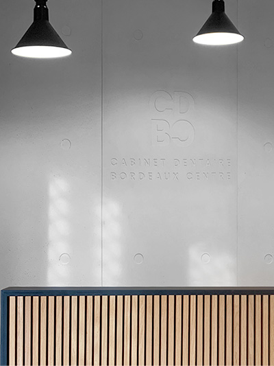
Beside the usual use on printed media and signs, the logo had to be printed on the concrete wall behind the front desk.
THE RESPONSE
To meet those specifications, the choice of a sans serif, modern and very legible font was obvious.
The logo was made as a contemporary and graphic acronym, very bold, with a contrasting thin and elegant tagline built in two lines to get a more compact effect and to increase the legibility.
To stand out even more from the dental field, a deep and sophisticated blue was chosen for the logo, matching the famous Hague Blue tint from Farrow & Ball that was used for the office walls.

